Amplify
The client
The UK’s #1 pitch doctors
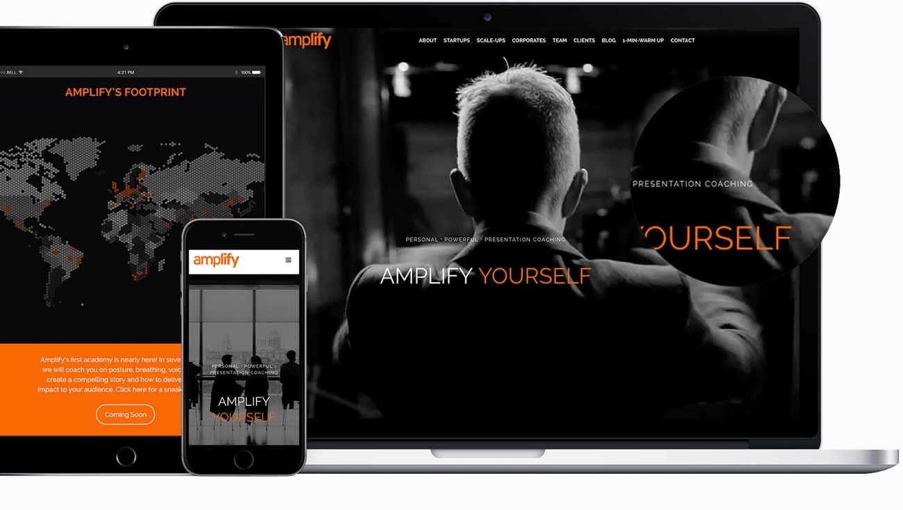
When Amplify’s came to us, they were looking for an upgrade online that would showcase the company’s successful progression from a one-man show to a full-fledged company.Highlighting a diversity of projects and clientele without looking overcrowded or inconsistent was a core priority. We employed a full-width video header and carefully curated sections to display as much engaging content as possible. The result was a smart, interactive page that showcases Amplify’s videos, blog content, and clients in a way that both excites and engages visitors.
visitors
(seconds)
visitors
per session
The branding

Logo
Happy with his previous logo, Amplify was looking to improve the look and feel of their website to create a modern and sleek experience for his clientele. Their brand is composed of a lettermark logo that uses a rounded sans-serif font with some straight angles on the edges, giving the brand a strong personality and character. Embodying their company name, the logo’s type starts of light, seemingly amplifying at the end to a bold type.
Typeface
When choosing a typeface, the idea was to keep the consistency between the brand’s richness and the website’s content. We selected, Raleway, a very legible, sans-serif type that allowed us to play with different thickness and visual weights, from thin to extra bold.

Color scheme
Amplify’s visual identity already relied on a set colour palette of bright orange and black. We wanted to build on this visual language and chose to apply the same colour scheme throughout the website on all pages. We employed white as a background colour and text main colour, and black and greyscale for pictures and paragraphs. We used the brand’s orange colour for headers, main titled and as an eye-catching accent colour.


