Caiger & Co
The client
A bespoke luxury catering in London
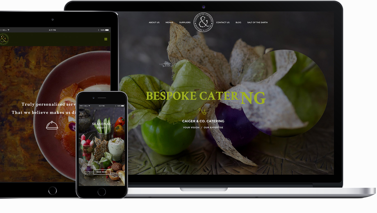
This bespoke luxury catering company was looking to revamp their look online and capitalize on their wonderful, fresh new imagery. We helped Caiger & Co. strategically curate their imagery throughout their new site in a way that would draw visitors in, instead of keeping the pictures all hidden in a gallery in one location on the site.
The trendy seasonal caterers already had a look that was on-point so we expanded and extrapolated that vision throughout their new website keeping the tonality and key visuals consistent and captivating.
(seconds)
traffic
on Google
keywords
The branding

Logo
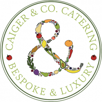
Playing off the logo we were provided, we were tasked with extrapolating the brand’s crisp and contemporary wholesomeness. Their colourful emblem type logo incorporates an ampersand that emphasises the name of the company and exudes both the friendliness and luxuriousness of the brand.
Typeface
Drawing on the logo’s typeface, we selected Crimson Text as the main font for titles and large headers. We combined this font with Montserrat, a playful sans-serif rounded font that is easy to read in a variety of sizes, to create a strong contrast and visual impact.

Color scheme
Utilising a consistent brand color was key. Employing a green monochromatic scale, we used different shades of the featured light green predominant in the design to remain consistent across pages and reflect the natural contemporary style of the brand.
Color scheme
Utilising a consistent brand color was key. Employing a green monochromatic scale, we used different shades of the featured light green predominant in the design to remain consistent across pages and reflect the natural contemporary style of the brand.


